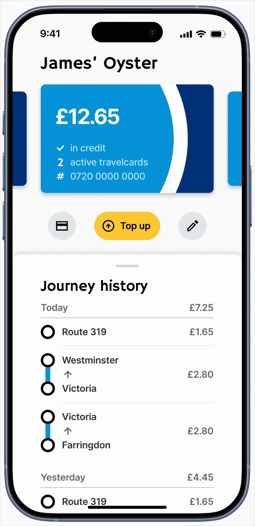
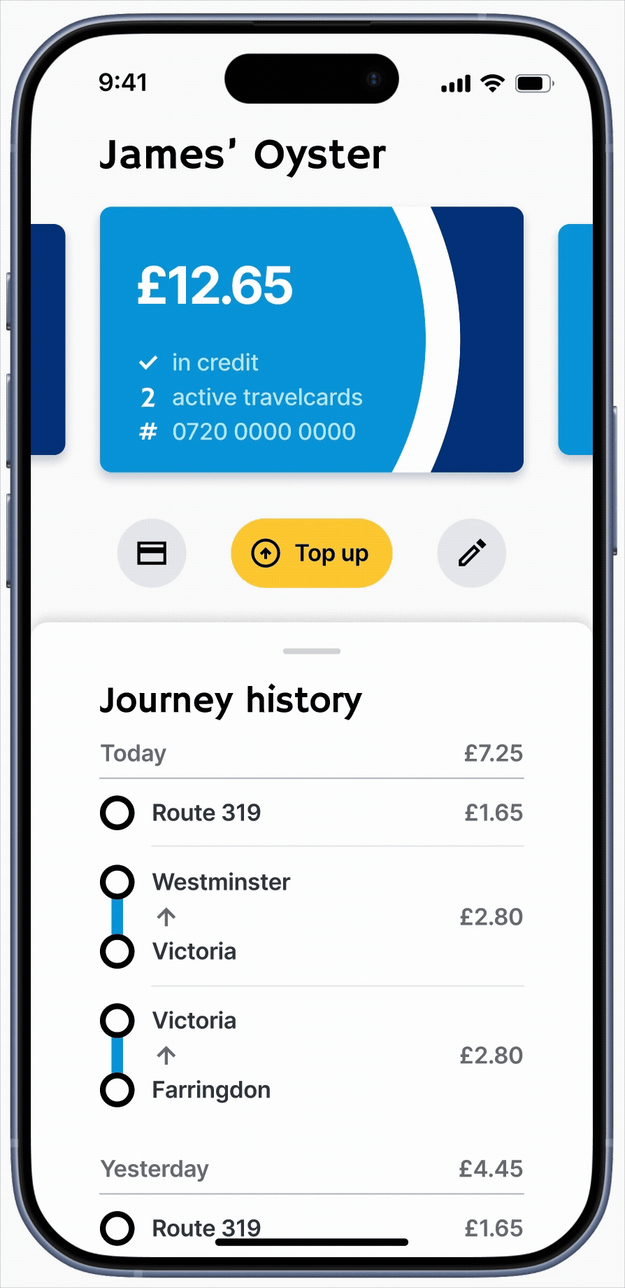
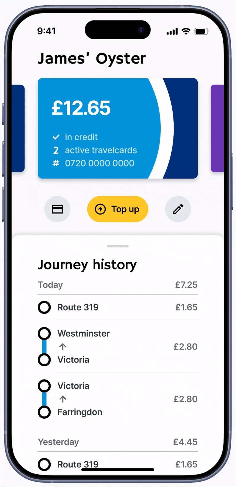
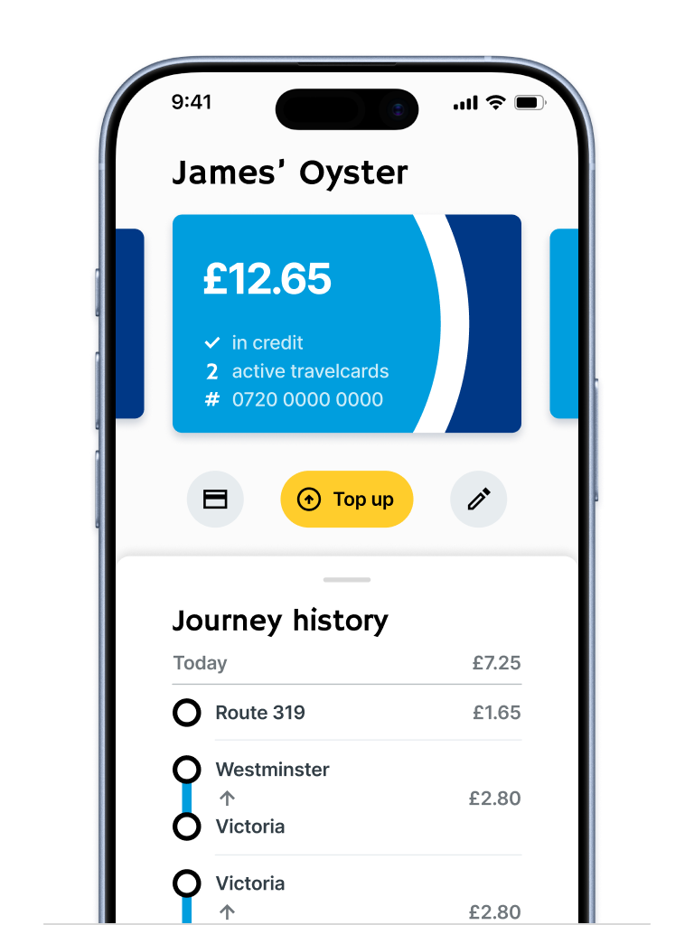
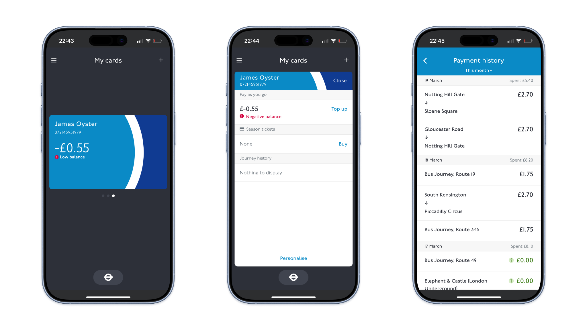
UI/UX CASE STUDY

Oyster App Redesign

The TfL Oyster app supports millions of journeys around London every day, and is often used in high-pressure, low-attention moments - at barriers, on platforms, or while walking. This personal project explores how simplifying navigation and prioritising core actions can reduce friction and improve user experience.

Project Overview

The existing Oyster app offers a range of features to help customers engage with their digital Oyster account, such as topping up their card, checking journey history, and purchasing season tickets - but struggles to surface the ones users rely on most. The experience is convoluted and difficult to use quickly, especially when in motion. As product designer, my primary goals were to improve speed and clarity for core tasks in low-attention contexts, improve accessibility and visual hierarchy, and align navigation with real usage patterns.

User Research

User Survey

I ran an online survey to understand how and when people use the Oyster app, focusing on primary goals per session, frequency of use, and pain points during real journeys. Three usage goals emerged as the clear priority for the majority of users: 1) viewing recent journeys; 2) checking card balances; 3) topping up a card. Secondary features, such as buying season tickets, were used infrequently but compete for attention on the home screen with the same prominence as primary features, creating unnecessary friction for high-frequency tasks.

Insight: The existing navigation system is not optimised for real user intents.

“What features do you primarily use the Oyster app for?”

Usability Testing

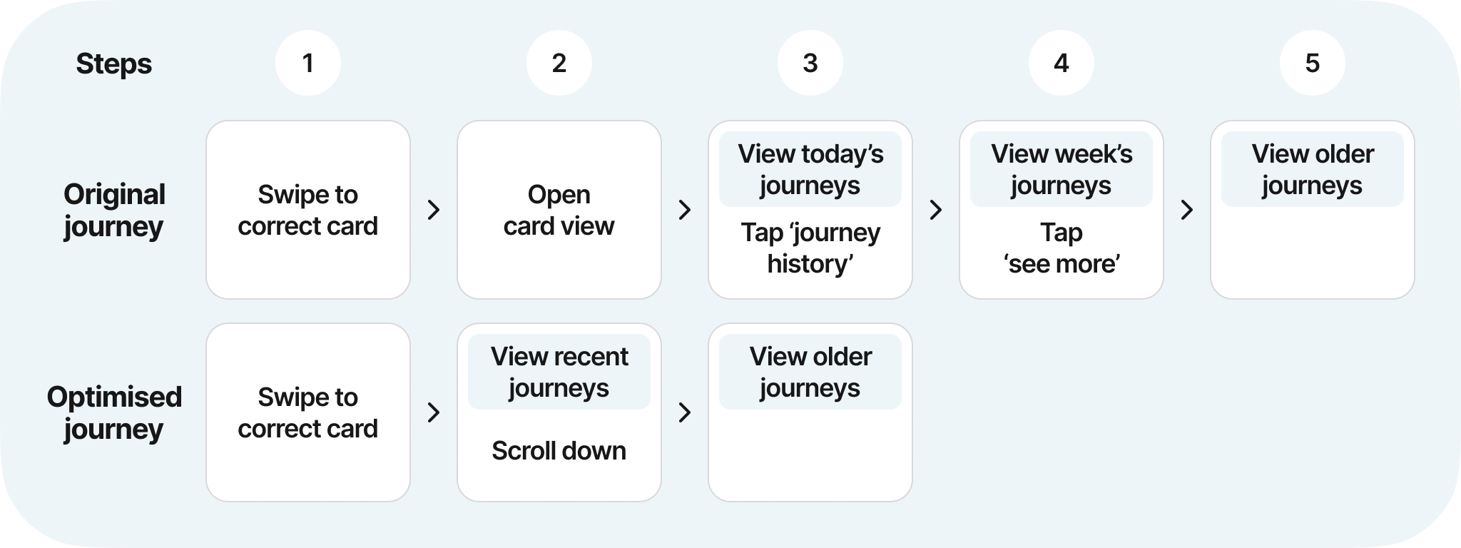
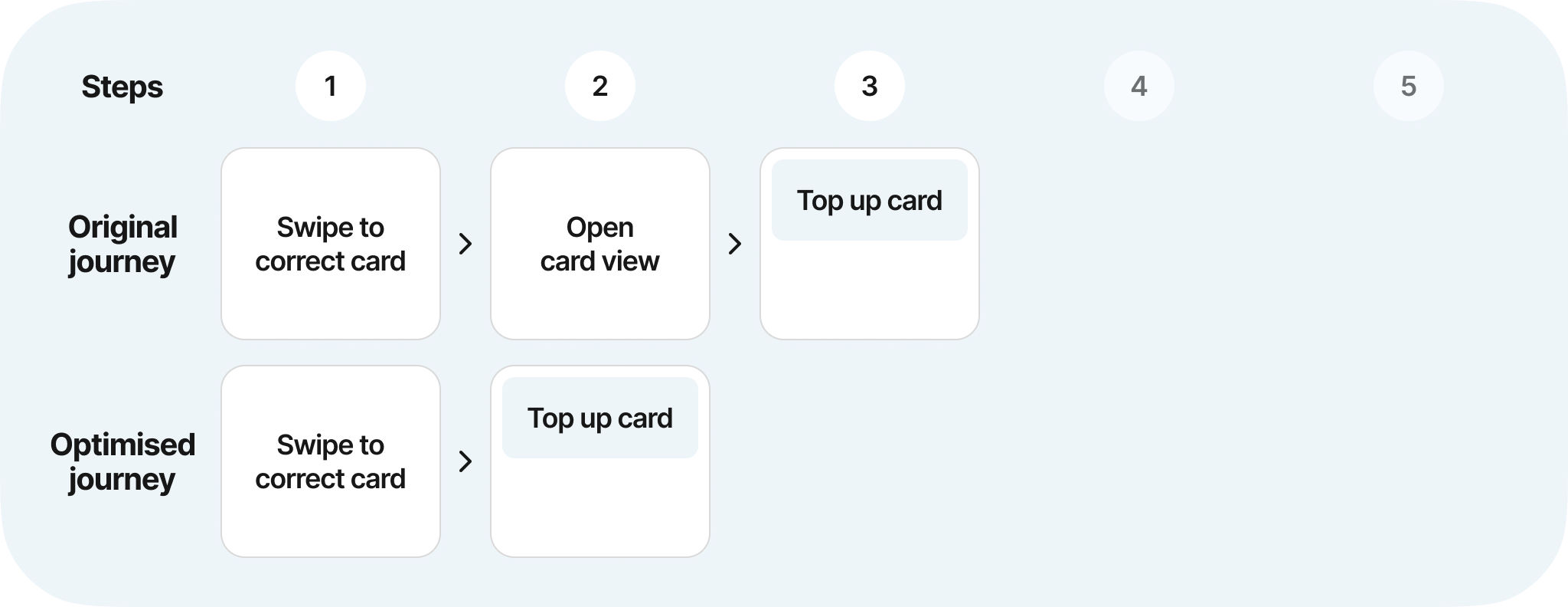
To understand how real commuters used the app, I challenged four members of the public at South Kensington tube station to complete the three tasks previously identified. Across all flows, users frequently struggled to find the correct entry point (especially for topping up or checking journey history), despite there often being multiple routes through the app to reach the desired goal. Certain UI elements, such as the main card element, were often assumed not to be clickable or swipable due to lack of affordances. Lack of visual cues on the cards also made them hard to distinguish, leading to confusion over which card they were viewing. In addition, small text also led some users to miss buttons or key information.

Insight: The app treated all features as equally important, forcing users to move through complex menus even for routine tasks. Compounded by small text and unclear navigation, this led to missed affordances and unnecessary friction completing routine tasks in real commuting conditions - highlighting a misalignment between interface hierarchy and user intent. This helps us arrive at our key problem statement:

“How can we enable Oyster users to access essential information and actions quickly and confidently, even when distracted or on the move?”

Ideation

Design exploration focused on four principles: 1) card balance should be immediately visible; 2) top-up should be a single, obvious action; 3) journey history should be accessible and readable at a glance; 4) navigation should reflect frequency of use.

Navigation Redesign

A card sort exercise revealed that the features users interacted with most were hidden many layers deep in menus. Many existing navigation items added cognitive overhead without proportional value. The new navigation model prioritises frequency of use, pushing lower-value features deeper into the hierarchy. Some features became less immediately visible, but core flows became faster and more predictable.

Navigation Optimisation: View Journey

Navigation Optimisation: Top Up Card

Final Prototypes

Home Screen Improvements

The home screen was redesigned to surface critical information immediately, removing the need to navigate to find card status or balance. Top-up flow is immediately accessible, with a larger touch target and prominent signposting. Visual cues indicate scrollable content for finding additional cards.

Impact: Steps to top up reduced from 3 → 2.

Journey History & Hopper Fare

Journey history was redesigned to be immediately visible from the Home Screen. Readability is improved through a new chronological ordering of journeys, and the new Hopper feature allows user to see the time remaining on their Hopper fare, allowing them to maximise its usage.

Impact: Steps to view recent journeys reduced from 3 → 2.

Card Personalisation

Optional card personalisation was introduced to reduce card-selection errors, particularly for users managing multiple Oyster cards. Cards now sport custom names and designs, which are aligned to real-world Oyster card to leverage instant recognition.

Impact: Reduced likelihood of incorrect card selection.

Secondary Feature Page

Infrequently used or lower-priority features were consolidated into a single secondary page, reducing competition with primary flows. ‘Add card’ action was surfaced more prominently, and basic journey mapping was improved with an expandable map feature.

Impact: Improved navigation to secondary features.

This project reinforced the importance of designing for low-attention environments. At scale, small inefficiencies compound quickly to create poor UX. Future work would include user testing and iteration of the prototypes, accessibility audits, and validation against real-world technical constraints.